Out of all the possible avenues in drawing, one of my favorites is having a table at illustration events. Last weekend was my first time at Feria Pegajosa, a fair that’s been running since 2022. I signed up in February, and by the end of the month, I got my spot confirmed. That meant one thing: I had exactly one month to prepare.
With the deadline clearly in sight, I’d been thinking about what artwork I could bring to exhibit or what I could turn into a new product. In both cases, I had to factor in printing times, which cut my available time even shorter. So, what could I do? How many problems would I have to solve?
Problem One: One Month to Create Something from Scratch
I’d been tossing around two themes I wanted to approach from a cultural angle: soccer and Argentina. The first one was quickly ruled out because I wasn’t sure how marketable products with that topic would be or what I could draw that would appeal to a broad audience. So, I went with illustrations themed around my country.
To kickstart some ideas, I opened Pinterest and typed REPÚBLICA ARGENTINA into the search bar. Scrolling through images of historical figures, iconic photos, and national maps, I stumbled upon one that grabbed me:

The texture of the lines, the arrangement of elements, and the limited color palette spoke to me in a powerful way. I felt like I was going to make Argentine-themed stickers, but I didn’t have much time to sketch and finalize, so I had to simplify the drawings as much as possible. So, I did what anyone would do to get organized: I made a list of ideas.

The first limitation was time, and the second was product dimensions. Without getting into financial details, the sticker sheet had to be 12cm x 18cm, and after setting up a template in Photoshop, the stickers would be around 4cm or 5cm. I printed both options (on my cartridge printer) to visualize them.
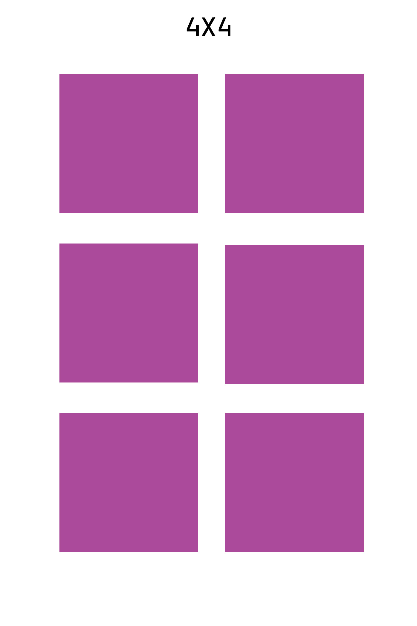
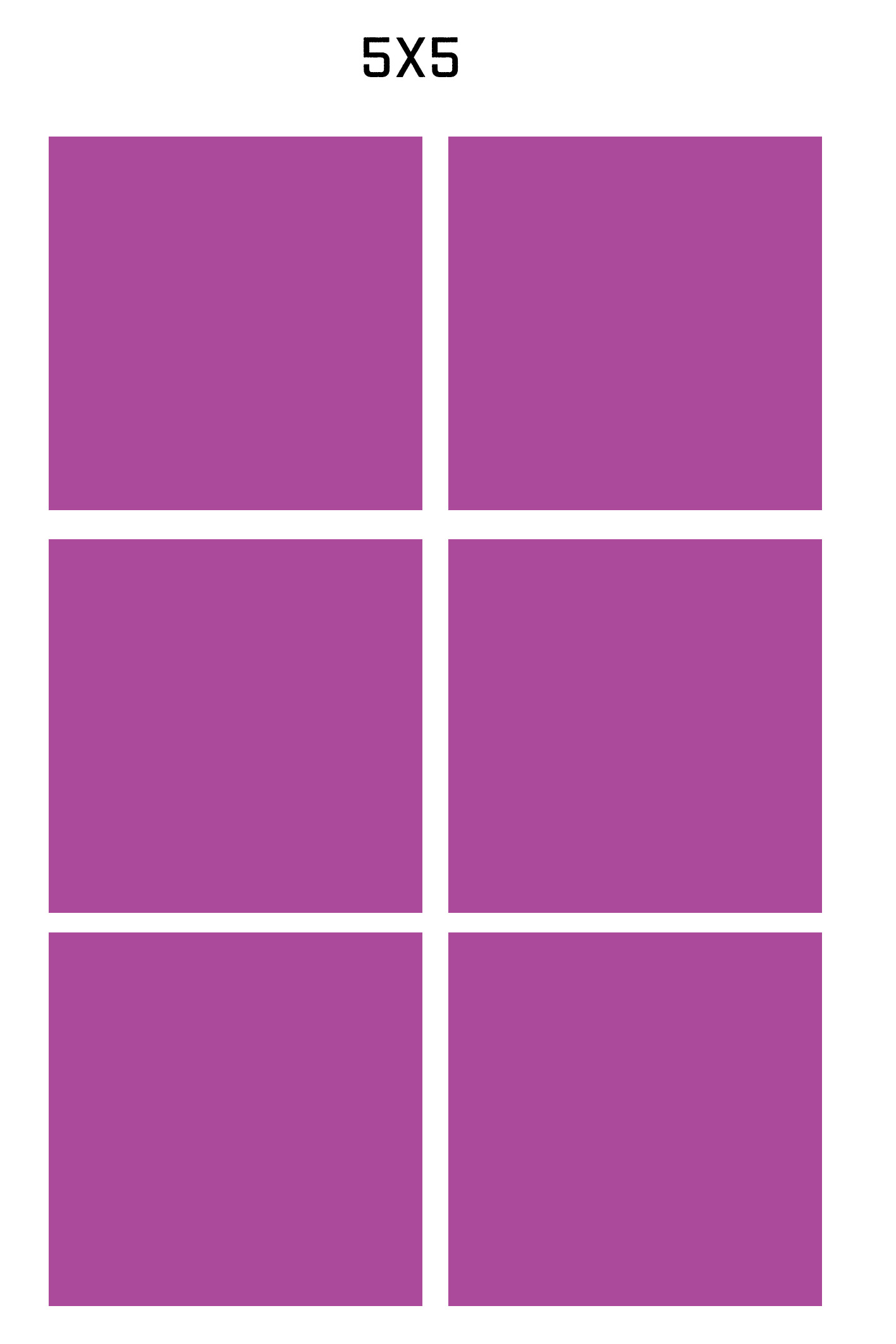
The choice is pretty obvious now, don't you think?
Now I had my list and dimensions figured out: just six drawings at 4cm each, since that size left enough space between the illustrations.
By this point, I knew they’d be black-and-white drawings because, with a limited palette, I’d add color digitally to speed things up.
I gathered reference images and started drawing, not overthinking details or making the illustrations too precise. I gave myself a rule: no more than three versions of each drawing.
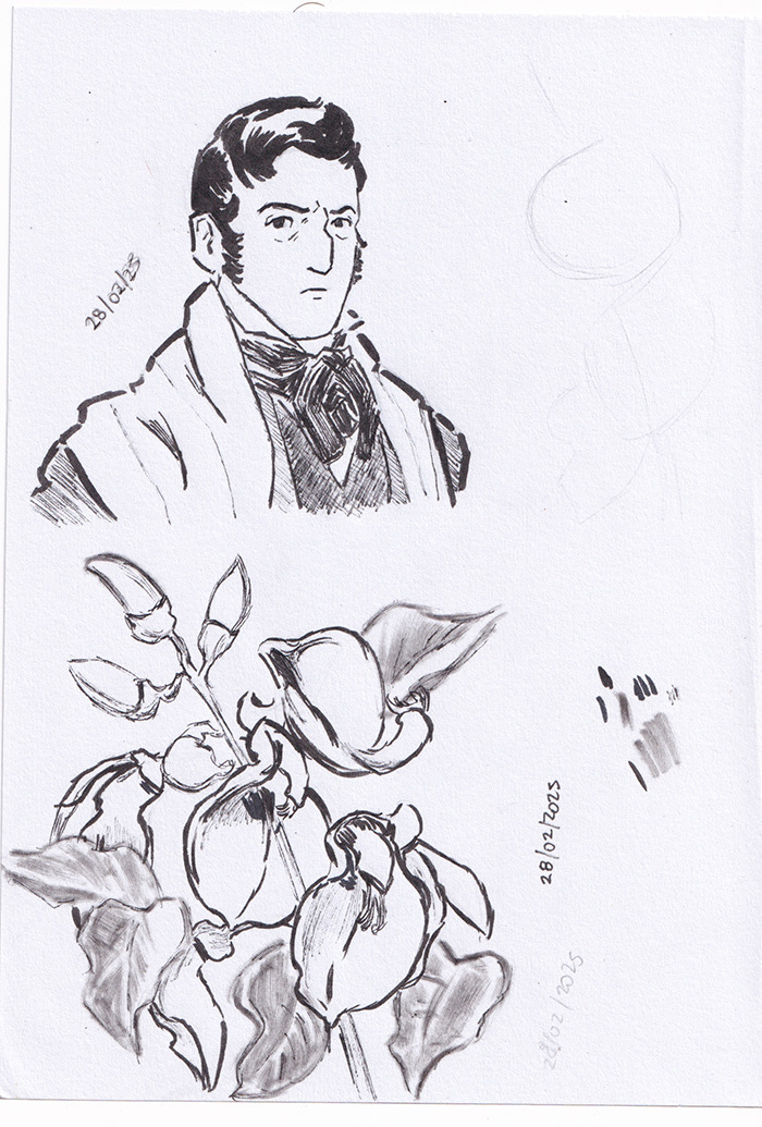
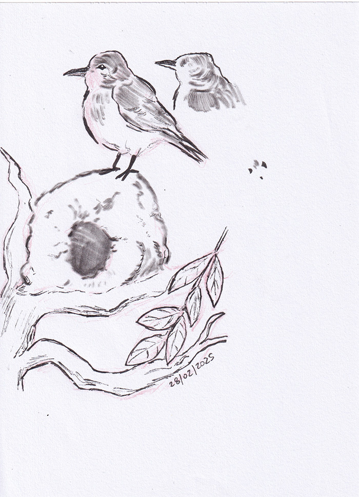
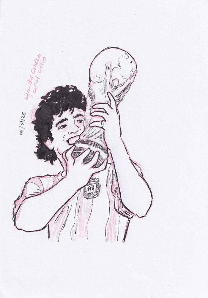
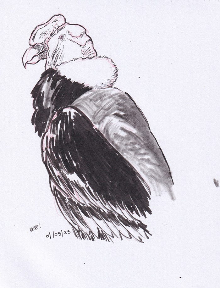
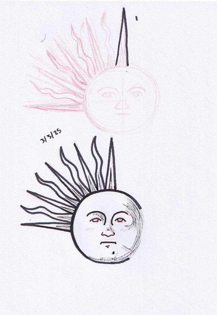
You can see in my sketches that I dated them and drew them over three days. You’ll also notice I made a second version of the hornero bird’s head because I wasn’t happy with the silhouette, a note to tweak Maradona’s drawing digitally, and a second attempt at the Sol de Mayo (probably the one that gave me the most doubts about translating into my style). I pushed through the small hurdles and moved on to the next stage: digital mockups.
Problem Two: The Stamp Effect
I gathered more stamp references because I needed to decide on fonts and how much (or what) text to include. One reference, in particular, became my compass.

I found the perfect font for "REPUBLICA ARGENTINA" and used it for whatever text I’d put on the stamps. And, of course, another obstacle popped up: Could I replicate the stamp texture? The internet gods were generous—I found a blog post sharing files to achieve the exact effect I wanted, complete with a detailed tutorial. Praise the internet!
Yet another question threatened my creative process: Did all the stamps have to be blue like the reference?
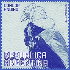
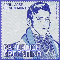
If there’s one thing I’ve learned from years of drawing, it’s that you shouldn’t cling to references—use them as a base to explore your own options. Following that principle, I gave each drawing a different color, making sure they harmonized when placed together on the sheet. With relief, I moved on to the final stretch.
Problem Three: Making Sure the Sheet Didn’t Compete with the Stickers
The stamps were finalized, so now it was time to design the sheet they’d sit on. I needed a title and couldn’t forget to include my name and social media handle. The header text came easily, but picking the right font was tricky.
Argentine identity always makes me think of fileteado porteño—classic, traditional styles—so I looked for vintage yet legible fonts. My go-to is Cooper Black, but it didn’t quite click. After browsing and testing on MyFonts, I landed on Store Clerk JNL Solid.
With the font hurdle cleared, I had to design the last piece: the background for the stickers. I love textures, but that would overwhelm the already detailed drawings. To solve it quickly, I went with a repeating pattern of the same stamps in a lighter shade, so they wouldn’t steal the spotlight.
And finally, after so many questions to answer and decisions to make, I sent the final design to the print shop (the day after I drew the Sol de Mayo!). Fingers crossed.
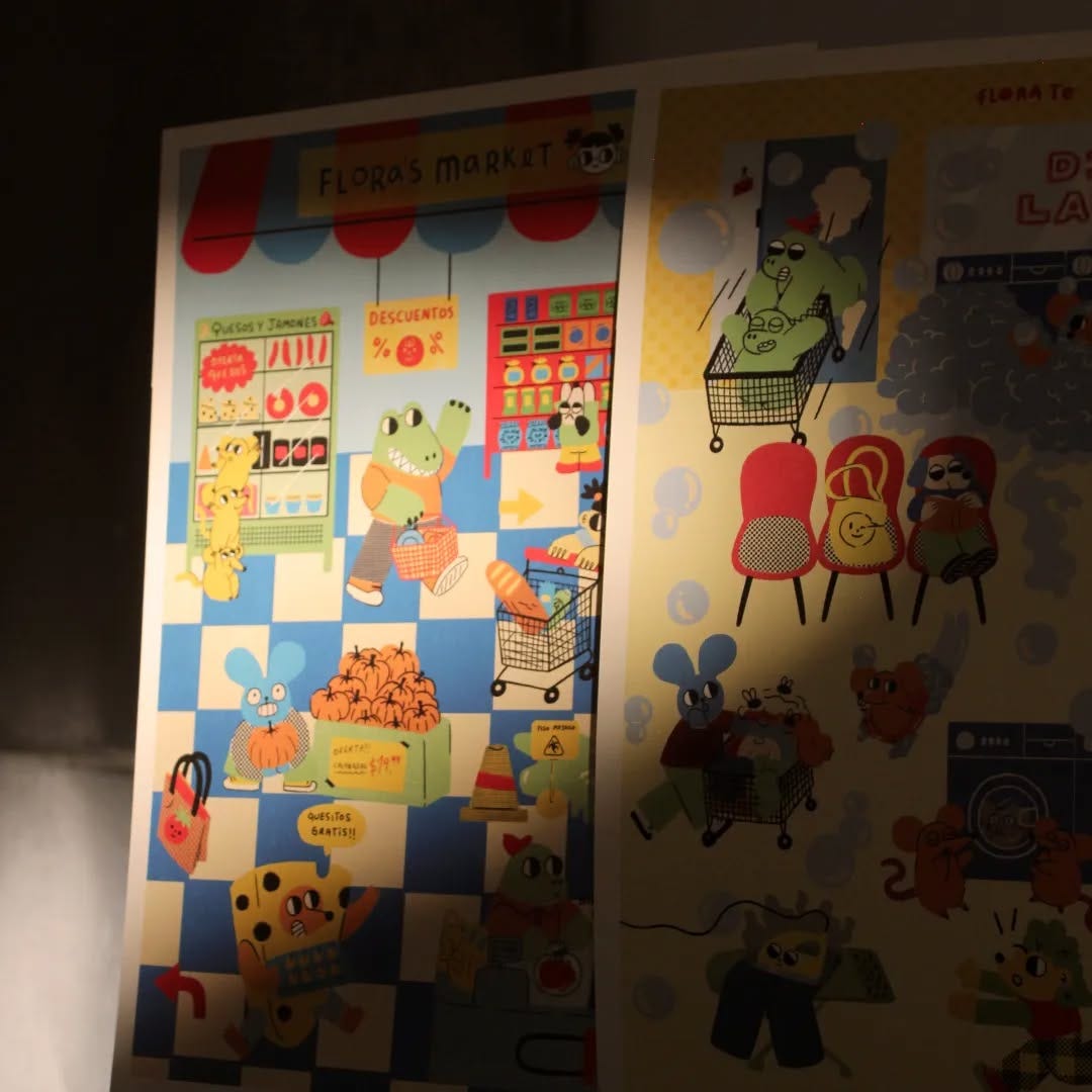
From the Printer to the Fair Table
A few weeks later, the stickers arrived in my hands, and I was over the moon.

The sheet made it to my table at Feria Pegajosa, and though nerves are always there, seeing the physical result after so many hours of work was incredibly rewarding. This whole journey reinforced one of my core mantras: less is more. And, of course—don’t panic when time’s running out!
What about you? Have you ever tackled a creative project against the clock? Would you like me to share another drawing process? Let me know!